Sphere for Business
A redesign of the live B2B microsite for a Vancouver device trade-in startup — and, along the way, the first style guide the company had.
- Role
- UI design, solo
- Client
- Sphere
- Timeline
- July – November 2022
- Tools
- Figma, Webflow
- Live site
- spherethat.ca ↗
Background
Sphere is a Vancouver-based startup offering laptop, tablet, and smartphone trade-in services. It runs a separate microsite for business, used to outline the structures and solutions it can offer existing and potential clients.
This was my first professional project in a user interface capacity. It was a solo build, but reviewed continuously by peers, seniors, and management.
The problem
The main website — including the Business microsite — needed a refresh. The existing design felt dated, the information was hard to parse, and the visual language had drifted from anything intentional.
The old microsite ran on one font at one weight and two colours: white and blue. There was nothing to design against.
Building a system first
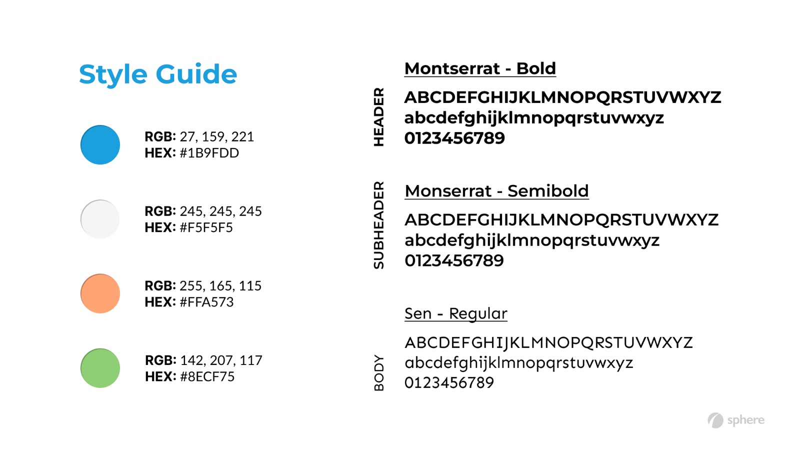
Before touching the page, I built the thing that was missing: a style guide defining appropriate colours and fonts, scoped so it could carry Sphere's future design work — not just this one microsite.
That gave every later decision something to be measured against, which is what turned a visual refresh into a repeatable system.
Before and after
After several rounds of iteration and feedback, the core decision I landed on was to keep the ethos of the old design and modernise around it, rather than replace it wholesale. Sphere's identity wasn't the problem; its hierarchy was.
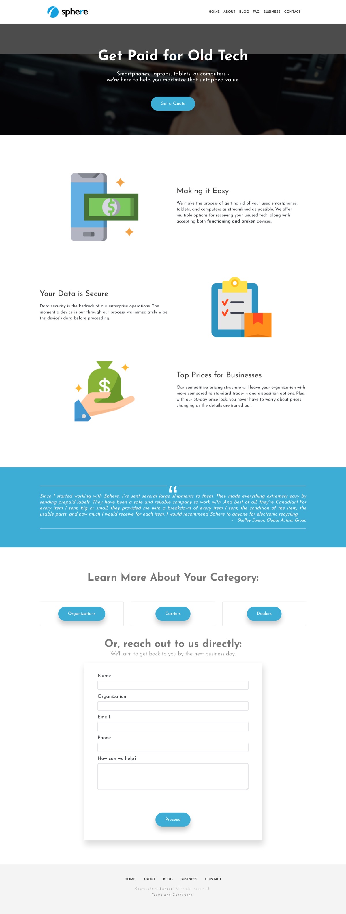
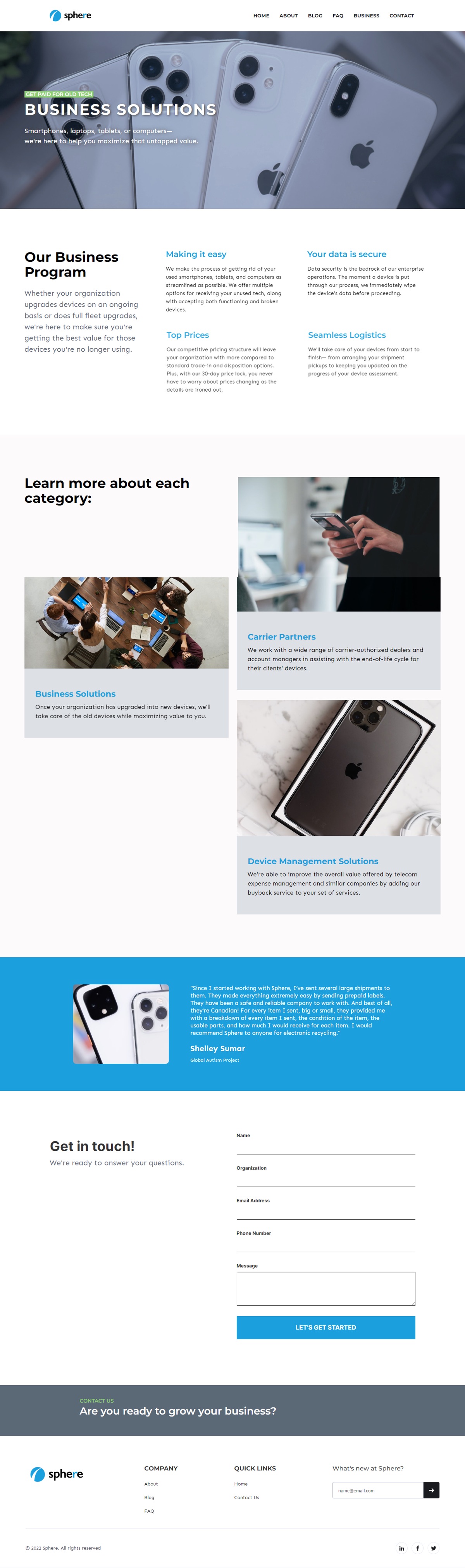
Both screenshots are full-page — scroll inside either frame to see the rest.
What I took from it
The feedback loop mattered more than any single design decision. Working solo on a whole microsite meant every critique from peers, seniors, and management was the only correction signal I had.
The bigger lesson was about skimmable content and intentional focal points. Business visitors weren't reading the page — they were scanning it for whether Sphere could solve their problem. Designing for that changed how I ranked everything on the page.