A contest platform for photographers who haven't been discovered yet
A speculative microsite for BOOOOOOOM — an authoritative voice in contemporary arts — built around online photo contests and a grid that stays out of the work's way.
- My role
- UX/UI research and design, prototyping, microsite building
- Team
- YuFeng D, Baolati P, Yujia W, Zak Z
- Timeline
- June – August 2022
- Tools
- Figma, Webflow
- Context
- Final project, Information Design
Background
The brief was to build a speculative microsite for an already-existing website using the design practices we'd learned across the semester. Our team chose booooooom.com, which describes itself as an authoritative voice in the new contemporary arts scene — highlighting emerging talent and launching the careers of young artists internationally.
Who we designed for
We narrowed to up-and-coming photographers — the audience most likely to already be on the site — and built a persona around a new photographer looking for exposure and prompts for inspiration.
The proposal followed from that: a microsite hosting online contests where this group can submit photographs for a chance to win and be featured on a winner profile page. Contest rules combine constraints designed to keep it fair across every level of skill, so a beginner isn't just competing against a professional's equipment.
The design problem wasn't "how do we show photos" — it was how do we make an unknown photographer feel like they have a real chance.
Design decisions
Black and white, minimal, Swiss
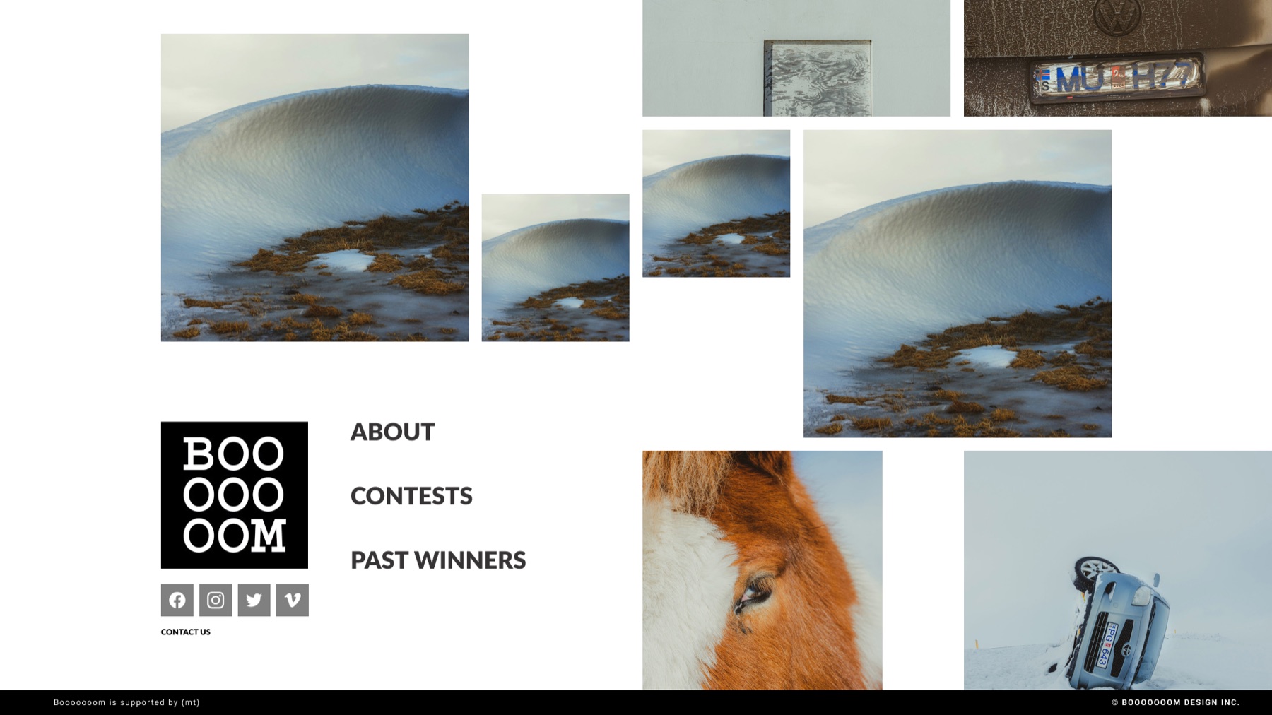
A clean and readable interface that keeps photographs highlighted at all times. Any colour in the chrome would compete with the submissions.
A rotating landing gallery
Multiple images cycling at once, so users can glance across many photographs simultaneously and click into anything that catches their eye — closer to how people actually browse photography than a paginated list.
Grids throughout
Spaced-out but unified. The grid does the work of making a set of unrelated images read as a single collection.
Direct inspiration: TOKYU Garden City, Masafumi Kitamaki, Guillaume Tomasi, The Covid Art Museum, Pallas, and Alicia Moore.
What I took from it
Working iteratively with a team of five meant navigating disagreement collectively rather than designing around it — and that's what produced an accessible result rather than four competing ones.
The lasting lesson was about empathising before specifying. Understanding what an undiscovered photographer actually needs came first; deciding what the experience should be came second. Doing it in that order is what made the contest mechanic obvious.