what·ism
Build a poster one layer at a time, and the sheet is read back as the art movement it most resembles. Fifteen movements, drawn live in the browser, in a single HTML file with no build step and no dependencies.
- Role
- Concept, design and build, solo
- Type
- Personal project
- Timeline
- August 2026
- Built with
- HTML, SVG, Claude Code
- Live site
- what-ism.net ↗
Why
Design history is usually taught as a list — names, dates, a slide of the famous poster. You can pass that and still not be able to tell a Bauhaus sheet from a Swiss one at a glance, because the difference isn’t a fact you memorise. It’s a set of decisions somebody made about a grid, a colour, and how the ink hit the paper.
So I inverted the quiz. Instead of asking what you already know, what·ism hands you a sheet and lets you make those decisions yourself — and then tells you whose company you just put yourself in.
How it works
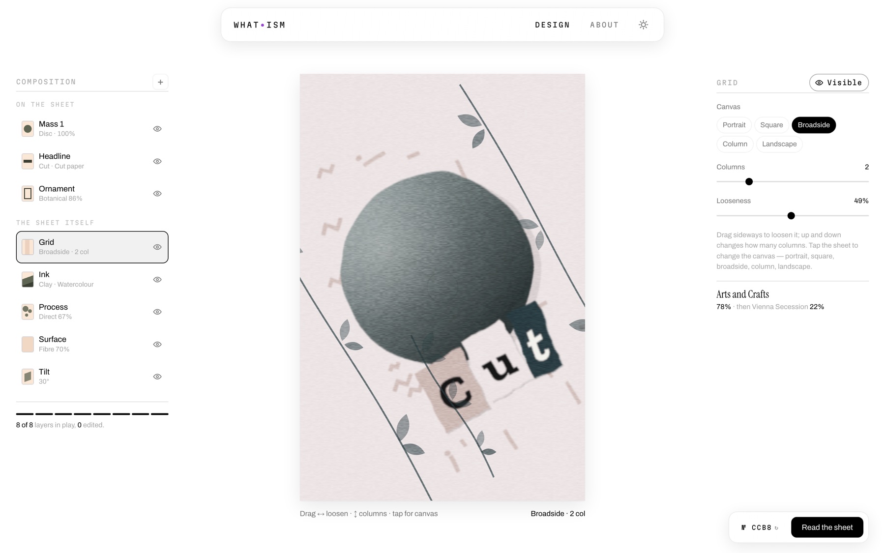
A sheet is eight layers. Three sit on top of it — a mass, a headline, an ornament — and five describe the sheet itself: grid, ink, process, surface, tilt. Every layer is a real control, and every change redraws the poster immediately.
Underneath, each movement is described by four axes: order, ornament, warmth, energy. Your sheet is scored against all fifteen on every edit, so the verdict in the corner is never a quiz result at the end — it moves while you work. Loosen the grid and watch Swiss International give way to Memphis.
The problem: every movement was the same poster
The first working version was a failure I could see but not name. All fifteen movements rendered, all fifteen scored correctly, and all fifteen looked like the same poster in different colours. The engine described a movement by four numbers and searched one shared vocabulary for values matching them — which can only ever produce one drawing, recoloured.
Four numbers and one vocabulary can only produce one drawing. Bauhaus and Memphis were the same sheet in another palette.
What was missing wasn’t more vocabulary — a bigger pool just gives two similar targets more ways to match. It was an axis nobody had modelled: how the sheet was physically made. I added six production techniques that emit real geometry rather than recolouring existing geometry — a halftone screen, torn photomontage, a visible setting-out drawing, off-register plates, brushwork, photocopy degradation — and six compositional archetypes underneath them.
The fitter now weights technique heavily enough that it can’t be traded away for a closer numeric fit, because technique is the whole difference between Dada and Swiss-in-another-palette. Fifteen movements now resolve to thirteen genuinely distinct drawings, where before they shared identical structure.

Same engine, same eight layers, same four axes — different physical process.
Two movements that refused to be different
Memphis and Psychedelic sit within a rounding error of each other on all four axes. Optimising those numbers alone landed both on the same palette, composition and process — correctly, and uselessly.
I made the fitting sequential and gave each movement a memory of what the ones before it had already used, so a later movement is repelled from vocabulary that is taken. The catch was that repulsion needs somewhere honest to go: without a suitability cost on every gene, movements paid for their difference with whichever gene was free, and De Stijl ended up wearing botanical trim. Charging for a bad fit on all of them forced the separation into differences each movement could actually carry. The two now share three of eight visible traits instead of five, and the axis match barely moved.
A gallery you can spin
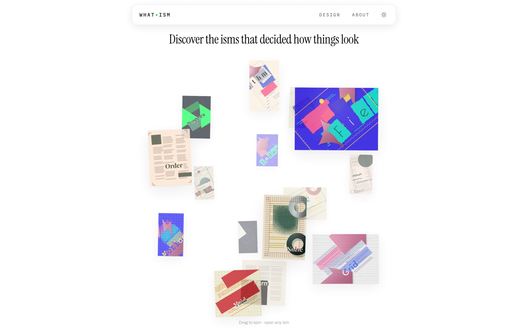
The fifteen movements sit on a sphere rather than in a grid, because the point is that they relate to each other rather than queue up. Each card is a point on a Fibonacci lattice, rotated and projected every frame, taking its scale and stacking order from its own depth — so spinning genuinely brings the back of the set around to the front.
Two decisions carry it. Orientation is an accumulated rotation matrix rather than a yaw and pitch pair, so the sphere turns freely from wherever it sits, with no pole to get stuck at and no angle to clamp. And every motion is scaled by elapsed time rather than counted per frame — before that, a 120 Hz laptop spun it at exactly twice the speed of a 60 Hz phone.
The reading room
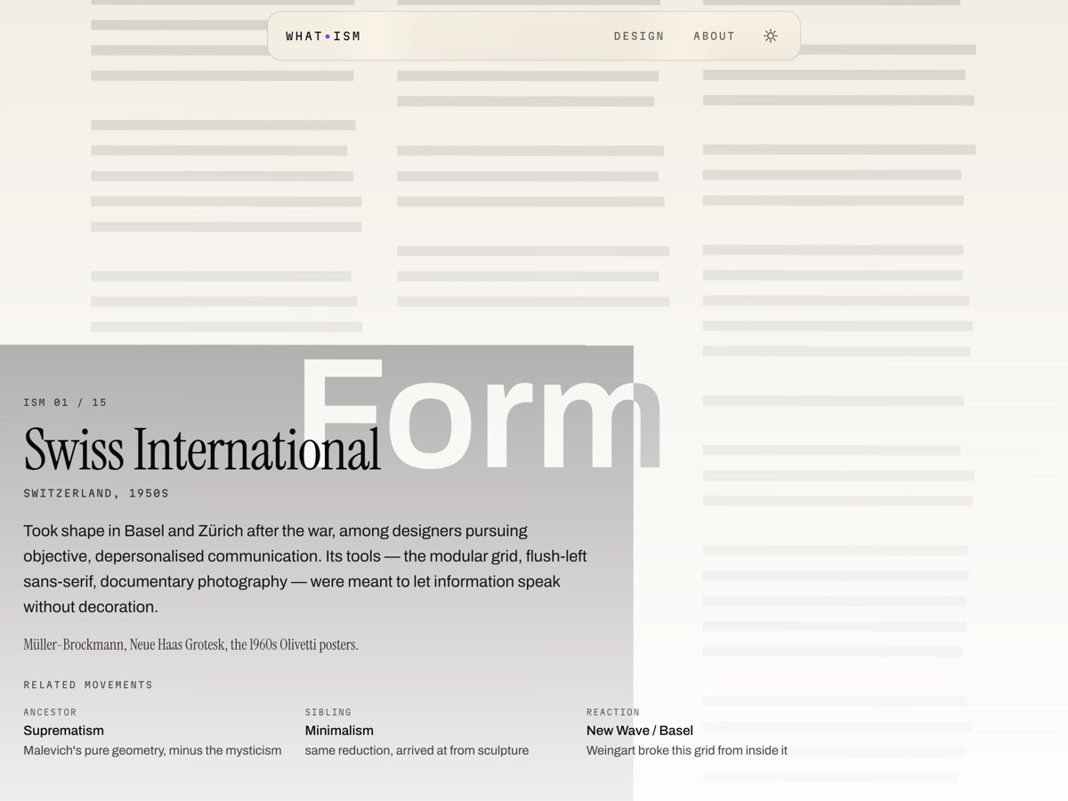
Opening a movement doesn’t open a page about it. That movement’s own sheet becomes the room — bled to the full viewport, with its history set over it. The text and scrim colours are picked from the artwork’s own luminance, so all fifteen stay legible without a single hand-tuned exception, and all fifteen fit without scrolling.
There is no close button. Double-click or double-tap anywhere and the room closes. That is a deliberate risk, so the room watches for someone who reads as trying to get out — a drag, or three scattered taps — and answers with a line of text under the bar. On a device with no cursor, where a transient prompt is meaningless, the line simply stays up for the whole visit.

What I took from it
The lesson I keep coming back to is that the first version wasn’t wrong, it was under-modelled. Everything worked to spec; the spec was just missing the axis that made the difference visible. Adding vocabulary would never have fixed it, and I would have spent a long time adding vocabulary.
The rest of it was about designing constraints rather than outputs. I never drew a single one of these fifteen posters. I described what each movement believes and what the paper can physically do, and let the engine argue itself to a result — which is a very different design job, and one I’d take again.